这篇文章,对Griffith Lab的DESeq解释分析过程。
理解数据
Griffith Lab使用的基因表达量矩阵共有54个sample,这些sample可分为1)normal,2)primary tumor以及3)colorectal cancer metastatic in the liver
从差异分析开始
获得差异表达分析结果
在使用DESeq()函数完成差异表达分析后(这里还是DESeq对象)需要函数才能获得其分析结果results()。
同时,需要提取相应组合差异表达分析的结果contrast=c()参数,
Note:
contrast()1)colData包含样本分类信息的列,2)分组1(log2FoldChange3)分组2(log2FoldChange的分母)。可以使用
summary()对创建的DESeq对象进行一些参数统计,e.g.增加基因数量
降低基因数量
离群gene占比
被判定为low counts的gene占比
MA plot怎么画?
以下图为例,
-
x轴为,gene标准化后对应read counts
-
y轴为gene表达量的倍数,以 l o g 2 log_{2} log2形式呈现
log2FoldChange>0.代表分组1上调,分组2下调
log2FoldChange<0.代表分组2下调,分组2上调
这张MA plot中的red dot代表表达量呈现显着差异的gene,grey dot代表表达量没有显著差异gene。
Note: l o g 2 ( 正常形式的倍数 ) = t h i s ?? v a l u e log_{2}(正常形式的倍数)=this \,\,value log2(正常形式的倍数)=thisvalue
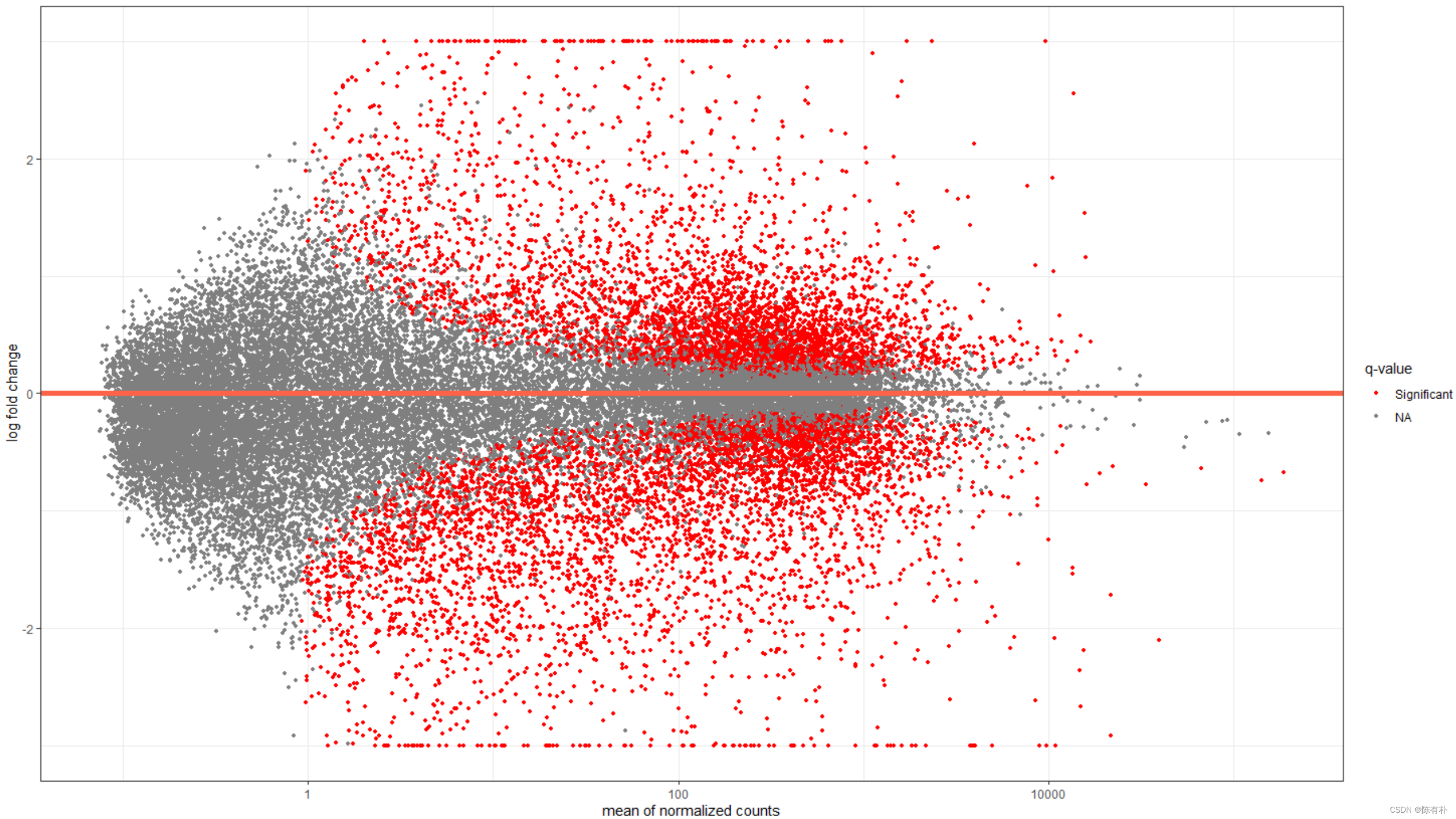
用DESeq2自带代码画MA plot
绘图代码如下,
# 直接画就行 plotMA(deseq2Results) 用ggplot2画MA plot
1、使用ggplot2仿着plotMA
绘图结果如下,
绘图代码如下,
library(ggplot2) library(scales) # needed for oob parameter library(viridis)   1.将DESeq结果转换为dataframe
deseq2ResDF <- as.data.frame(deseq2Results)
# 2. 对gene添加“是否呈现显著差异表达”的标签
deseq2ResDF$significant <- ifelse(deseq2ResDF$padj < .1, "Significant", NA)
# 以baseMean作为x,log2FoldChange作为y
# 以significant作为分类变量
ggplot(deseq2ResDF, aes(baseMean, log2FoldChange, colour=significant)) +
	geom_point(size=1) +
	scale_y_continuous(limits=c(-3, 3), oob=squish) +
	scale_x_log10() +
	geom_hline(yintercept = 0, colour="tomato1", size=2) +
	labs(x="mean of normalized counts", y="log fold change") +
	scale_colour_manual(name="q-value", values=("Significant"="red"), na.value="grey50") +
	theme_bw()
在绘图细节上,有几个需要注意的地方,
-
导入
library(scales)之后,在scale_y_continuous()处添加的oob=squish参数,不会将超出所设置的y轴范围之外的点排除(即转变为NA),而是将它们“挤”在边缘 -
设置
scale_x_log10(),将baseMean转换为以10为底的对数
2、ggplot2高级版
绘图结果如下,
绘图代码如下,
library(viridis)
ggplot(deseq2ResDF, aes(baseMean, log2FoldChange, colour=padj)) +
	geom_point(size=1) +
	scale_y_continuous(limits=c(-3, 3), oob=squish) +
	scale_x_log10() +
	geom_hline(yintercept = 0, colour="darkorchid4", size=1, linetype="longdash") +
	labs(x="mean of normalized counts", y="log fold change") +
	scale_colour_viridis(direction=-1, trans='sqrt') +
	theme_bw() +
	geom_density_2d(colour="black", size=2)
增添了2个函数,
-
scale_colour_viridis(),针对的是映射函数中设置的colour=选项。此处将padj,即FDR矫正过后的p-value,呈现为一个梯度变化的可视化结果(从紫到黄,即代表了从非常不显著到极显著)
direction=设置颜色的梯度走向,若设置为1,与上述结果呈现相反的走向 -
geom_density_2d()函数的说明书在这了:https://ggplot2.tidyverse.org/reference/geom_density_2d.html
单个基因的表达量变化怎么画?
绘图部分
先使用plotCounts()函数,将对应gene的表达量数据提取出来,
otop2Counts <- plotCounts(deseq2Data,
                          gene="ENSG00000183034",
                          intgroup=c("tissueType", "individualID"),
                          returnData=TRUE)
需要给定intgroup=c()指定参数,
- 第一个参数为colData中的样本分类信息列名(e.g. 此处的为tissueType,还有很多其他的例子,使用的是condition)
- 第二个参数为样本 ID信息
绘图代码如下,
colourPallette <- c("#7145cd","#bbcfc4","#90de4a","#cd46c1","#77dd8e","#592b79","#d7c847","#6378c9","#619a3c","#d44473","#63cfb6","#dd5d36","#5db2ce","#8d3b28","#b1a4cb","#af8439","#c679c0","#4e703f","#753148","#cac88e","#352b48","#cd8d88","#463d25","#556f73")

ggplot(otop2Counts, aes(x=tissueType, y=count, colour=individualID, group=individualID)) +
	geom_point() +
	geom_line() +
	theme_bw() +
	theme(axis.text.x=element_text(angle=15, hjust=1)) +
	scale_colour_manual(values=colourPallette) +  # 将已经调好的颜色传递给scale_colour_manual()
	guides(colour=guide_legend(ncol=3)) +
	ggtitle("OTOP2")
绘图结果如下,
「这个图好看的点,我自己觉得有两个,设置了2个分组,让结果非常清晰」
验证read counts部分
deseq2ResDF["ENSG00000183034",]
rawCounts["ENSG00000183034",]
normals=row.names(sampleData[sampleData[,"tissueType"]=="normal-looking surrounding colonic epithelium",])
primaries=row.names(sampleData[sampleData[,"tissueType"]=="primary colorectal cancer",])
# 在normal组织中的raw counts
rawCounts["ENSG00000183034",normals]
# 在primary tumor中的raw counts
rawCounts["ENSG00000183034",primaries]
热图怎么画?
基础热图
绘制代码如下,
# 将DESeq对象进行variance stablilizing transform
deseq2VST <- vst(deseq2Data)

# 再将结果转换为dataframe
deseq2VST <- assay(deseq2VST)
deseq2VST <- as.data.frame(deseq2VST)
# 获取gene ID
deseq2VST$Gene <- rownames(deseq2VST)
# head(deseq2VST)
Note:
assay()的作用?这边就不展开将了,先给自己挖一个坑,以后会写一篇关于这个的实战。学习资料先放在这里:https://bioconductor.org/help/course-materials/2019/BSS2019/04_Practical_CoreApproachesInBioconductor.html
# 只保留log2FoldChaneg > 3的差异表达基因
sigGenes <- rownames(deseq2ResDF[deseq2ResDF$padj <= .05 & abs(deseq2ResDF$log2FoldChange) > 3,])
deseq2VST <- deseq2VST[deseq2VST$Gene %in% sigGenes,]

# 数据类型转换:width to long
library(reshape2)
deseq2VST_wide <- deseq2VST
deseq2VST_long <- melt(deseq2VST, id.vars=c("Gene"))

# 覆盖原始VST数据
deseq2VST <- melt(deseq2VST, id.vars=c("Gene"))

# 绘制热图
# 以样本作为x,gene ID作为y,填充值映射到fill
heatmap <- ggplot(deseq2VST, aes(x=variable, y=Gene, fill=value)) +
	geom_raster() +
	scale_fill_viridis(trans="sqrt") +
	theme(axis.text.x=element_text(angle=65, hjust=1),
          axis.text.y=element_blank(),
          axis.ticks.y=element_blank())
# heatmap
使用的函数为
-
geom_raster(),将颜色映射到每一个区块的数值(类似函数为geom_tile())官方说明文档:https://ggplot2.tidyverse.org/reference/geom_tile.html
添加聚类树的热图
# 将长数据类型转换为宽数据类型
deseq2VSTMatrix <- dcast(deseq2VST, Gene ~ variable)
rownames(deseq2VSTMatrix) <- deseq2VSTMatrix$Gene
deseq2VSTMatrix$Gene <- NULL

# 计算距离,没印象的看看多元统计
# 以下分别基于gene和sample进行了距离计算
distanceGene <- dist(deseq2VSTMatrix)
distanceSample <- dist(t(deseq2VSTMatrix))  # 转置后再计算

# 根据上一步计算得到的距离进行聚类分析
clusterGene <- hclust(distanceGene, method="average")
clusterSample <- hclust(distanceSample, method="average")

# 构建基于sample的聚类树
# install.packages("ggdendro")
library(ggdendro)
sampleModel <- as.dendrogram(clusterSample)
sampleDendrogramData <- segment(dendro_data(sampleModel,
                                            type = "rectangle"))
sampleDendrogram <- ggplot(sampleDendrogramData) +
	geom_segment(aes(x = x, y = y, xend = xend, yend = yend)) +
	theme_dendro()

# 将sample聚类结果添加到原始数据集中
deseq2VST$variable <- factor(deseq2VST$variable,
                  levels=clusterSample$labels[clusterSample$order])

# 绘制聚类树
library(gridExtra)
grid.arrange(sampleDendrogram, heatmap, ncol=1, heights=c(1,5))
需要额外用到的几个R packages,
ggdendrogridExtra
绘图结果如下,
但是上述添加到原始图层上的树,和heatmap中sample所对应的位置实际上是不一样的,
精修代码如下,
library(gtable)
library(grid)

# Modify the ggplot objects
sampleDendrogram_1 <- sampleDendrogram + scale_x_continuous(expand=c(.0085, .0085)) + scale_y_continuous(expand=c(0, 0))
heatmap_1 <- heatmap + scale_x_discrete(expand=c(0, 0)) + scale_y_discrete(expand=c(0, 0))

# Convert both grid based objects to grobs
sampleDendrogramGrob <- ggplotGrob(sampleDendrogram_1)
heatmapGrob <- ggplotGrob(heatmap_1)

# Check the widths of each grob
sampleDendrogramGrob$widths
heatmapGrob$widths

# Add in the missing columns
sampleDendrogramGrob <- gtable_add_cols(sampleDendrogramGrob, heatmapGrob$widths[7], 6)
sampleDendrogramGrob <- gtable_add_cols(sampleDendrogramGrob, heatmapGrob$widths[8], 7)

# Make sure every width between the two grobs is the same
maxWidth <- unit.pmax(sampleDendrogramGrob$widths, heatmapGrob$widths)
sampleDendrogramGrob$widths <- as.list(maxWidth)
heatmapGrob$widths <- as.list(maxWidth)

# Arrange the grobs into a plot
finalGrob <- arrangeGrob(sampleDendrogramGrob, heatmapGrob, ncol=1, heights=c(2,5))

# Draw the plot
grid.draw(finalGrob)


# Re-order the sample data to match the clustering we did
sampleData_v2$Run <- factor(sampleData_v2$Run, levels=clusterSample$labels[clusterSample$order])

# Construct a plot to show the clinical data
colours <- c("#743B8B", "#8B743B", "#8B3B52")
sampleClinical <- ggplot(sampleData_v2, aes(x=Run, y=1, fill=Sample.Characteristic.biopsy.site.)) +
	geom_tile() +
	scale_x_discrete(expand=c(0, 0)) +
	scale_y_discrete(expand=c(0, 0)) +
	scale_fill_manual(name="Tissue", values=colours) +
	theme_void()

# Convert the clinical plot to a grob
sampleClinicalGrob <- ggplotGrob(sampleClinical)

# Make sure every width between all grobs is the same
maxWidth <- unit.pmax(sampleDendrogramGrob$widths, heatmapGrob$widths, sampleClinicalGrob$widths)
sampleDendrogramGrob$widths <- as.list(maxWidth)
heatmapGrob$widths <- as.list(maxWidth)
sampleClinicalGrob$widths <- as.list(maxWidth)

# Arrange and output the final plot
finalGrob <- arrangeGrob(sampleDendrogramGrob, sampleClinicalGrob, heatmapGrob, ncol=1, heights=c(2,1,5))
grid.draw(finalGrob)
参考资料
[1] https://genviz.org/module-04-expression/0004/02/01/DifferentialExpression/